
Artist User Profile Update
DeviantArt is the world’s largest online art community, with 70+ million users and 45 million unique monthly visitors. Artists use the site to share and promote their art and connect with other art lovers.
This goal for this project was to redesign the user profile page, redesigning the page looking at layout and function and also recommending new product features.
Researching the competition
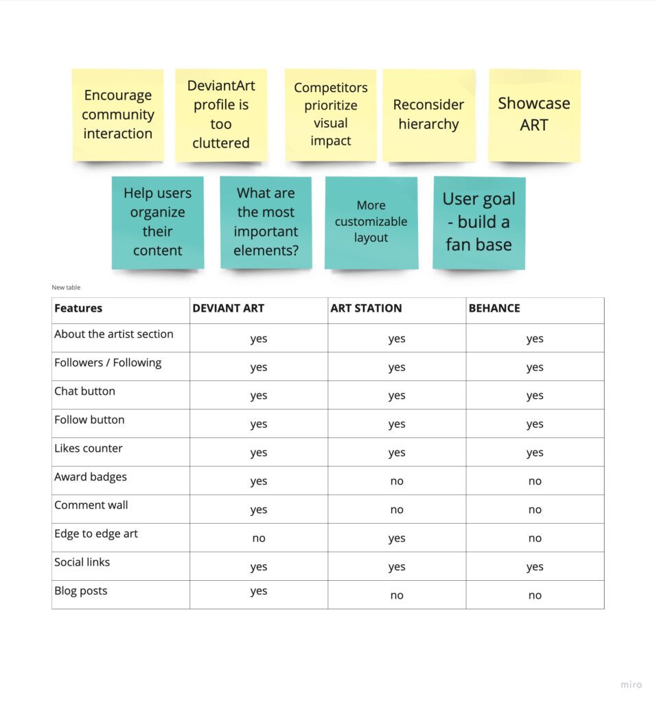
ArtStation and Behance are major competitors to DeviantArt and both platforms provide profile pages to enable artists to display their art, share information about themselves and interact with other members of the online community.
Key takeaways: The competitors products have similar goals to DA, providing users with tools to encourage community engagement and interaction.
Features include an ‘About the artist’ section, following/followers, prominent chat and follow buttons, ‘like’ counters and social media links. However their profile pages offer a cleaner, more visually impactful look than the DA profile. The competitors make displaying art the number one priority and minimize other features on the profile page.
Analyzing the existing user profile
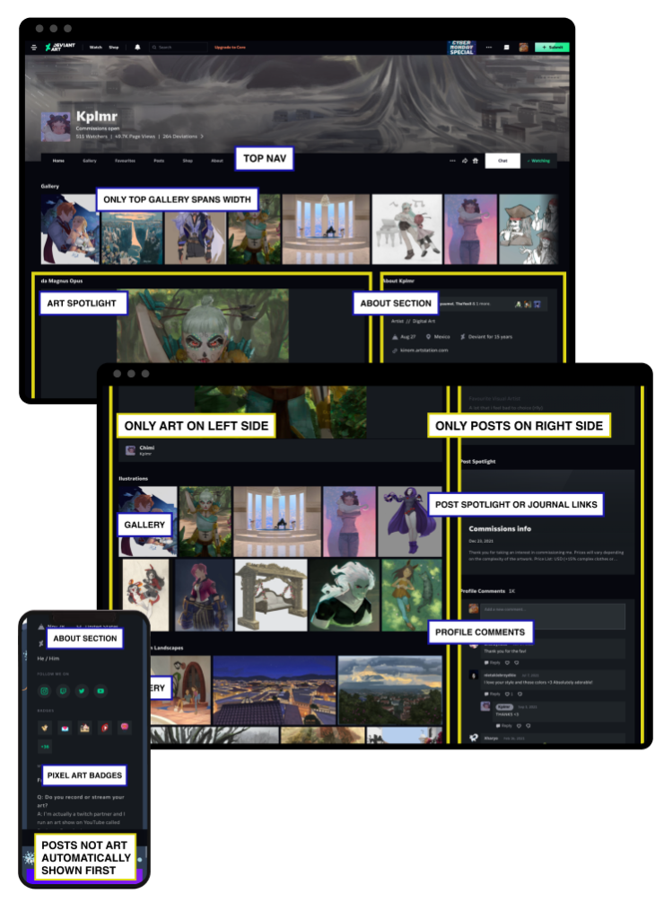
The existing profile had a lack of customization options and a rigid layout that users found limiting.
The profile was divided into a 2 sides. On desktop view the left side of the page was fixed at 2/3 of the screen and could only be used for art galleries and art spotlight. The right side was fixed at 1/3 and could only be used for posts, for example journal/blog posts, updates, polls and user comments.
On mobile the posts were forced to the top of the content so users had to scroll past all the posts before getting to see any art. Art was not the priority in the mobile UX.
• There is no clear hierarchy of content
• Art is not prioritized in the mobile layout
• Content is forced into a 2/3 and 1/3 layout on desktop
• User’s profiles tend to look chaotic and busy
• Lack of ways to customize profiles
• Users cannot control the number of images in a gallery section
• Users cannot edit how images look in the galleries
• No customizable way to organize content for individual needs
• Cover image does not support gifs
User personas & goals
In order to understand the types of user who are using the profile to showcase their art and interact with the community I developed user personas, using available data about our users and insights from the marketing team.

New artist - young or inexperienced
• Wants to find community
• Watches tutorials
• Nervous about posting art – wants encouragement
• Comments, favs, shares emoticons

Mid level artist - art is improving
• Has established art style and some fans
• Wants to build up their fan base
• Comments, favs, shares emoticons
• Interested in offering subscriptions, selling prints or offering commissions
• Comments, favs

Professional - established artist
• Has an established fan base
• Shows art on multiple platforms
• May stream art creation on Twitch
• These artists strengthen the community and are aspirational for newer artists
• Interested in offering subscriptions
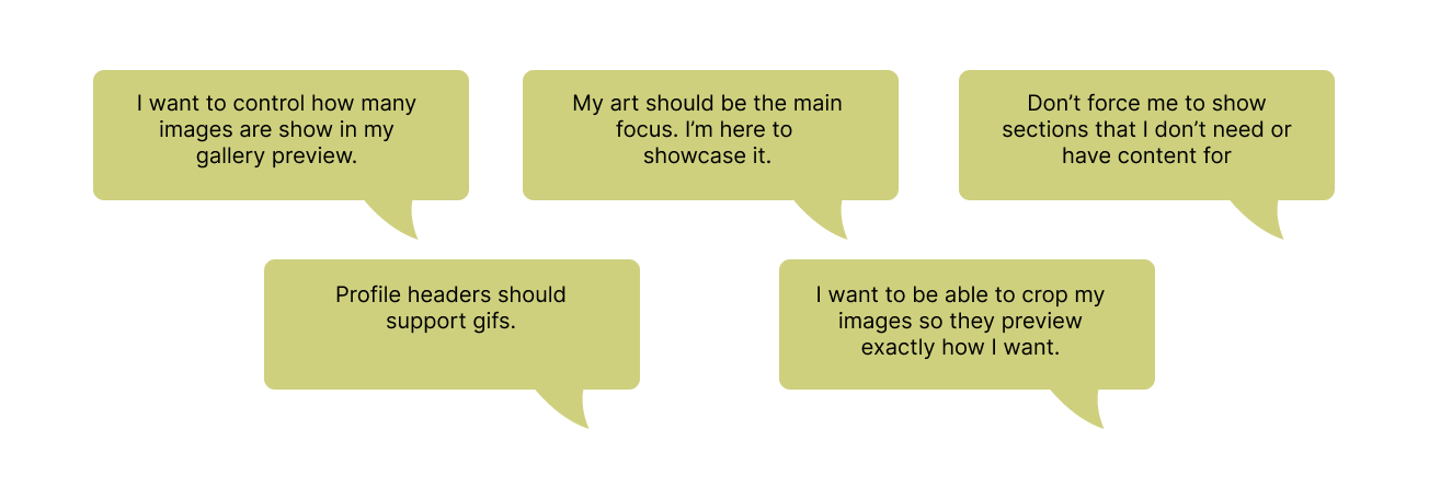
User comments
We also gathered feedback from users about the current profile page.
Wireframes
Taking into account the research, user feedback and user goals I redesigned the profile page.
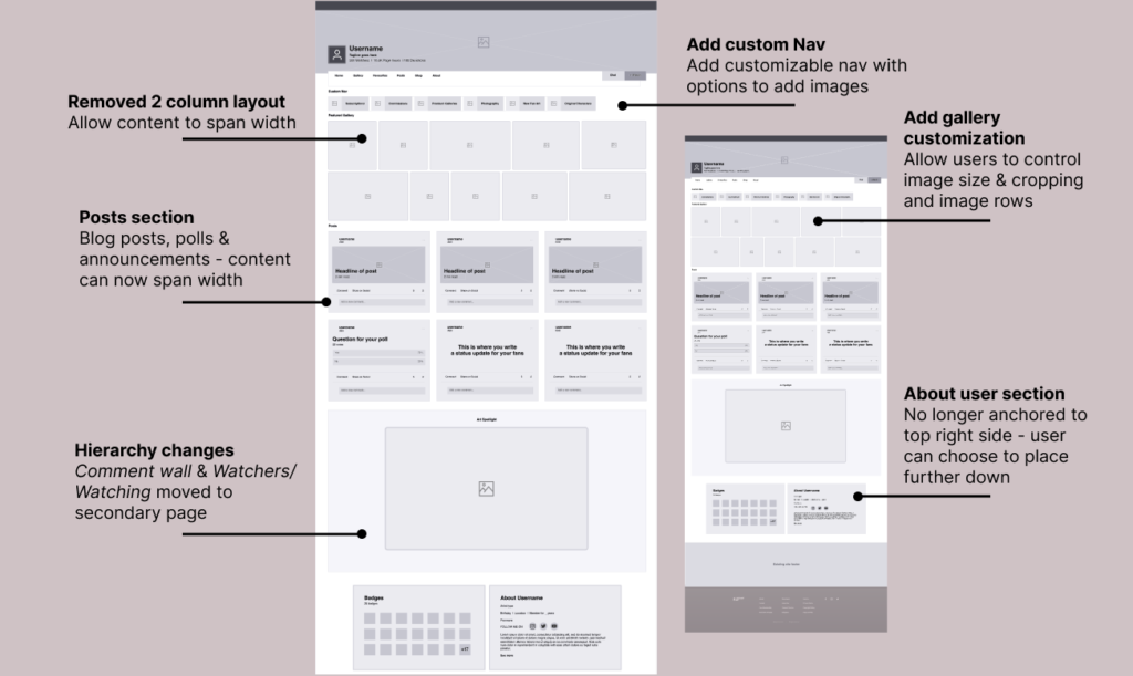
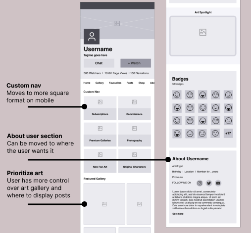
I created these wireframes to show the new layout, hierarchy and features.
Key updates / changes
Remove 2 columns / Break out of the 2 column layout to allow content to span the screen width
Prioritizing art / reordering the layout for a more clean and impactful look
Custom nav / Add a new custom navigation – users can direct fans to their art commissions, subscriptions and art grouped by theme or medium
Reconsidered hierarchy / Remove elements of content – to make the profile less cluttered and visually more appealing some content was moved to a secondary page
Gallery customization / Add ability to crop and size artwork and also control number of rows in a gallery
Move About User section / No longer anchored to top right side of the profile, user can choose to move this section down the page
Header image / Add ability to make header image a gif
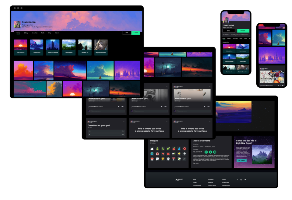
New Artist User Profile - Color mocks
Now the content on the page has been freed from the 2 column layout it can span the full width and the gallery can be more impactful. I added a new, customizable navigation so that users could organize their content and lead fans to their commissions or subscriptions.
Key takeaways: The new design allows the art to shine with a cleaner and more impactful layout, there are increased options for artists to promote their work and a more considered hierarchy of profile content.

Promoting marketing content
At DeviantArt there is an ethos of using the products the team creates to promote the company’s marketing content. The team want to use the same products that are available to the users.
Collaborating with the marketing team, together we planned how to use the new profile page design to showcase new contests, art resources, product guides and community highlights.
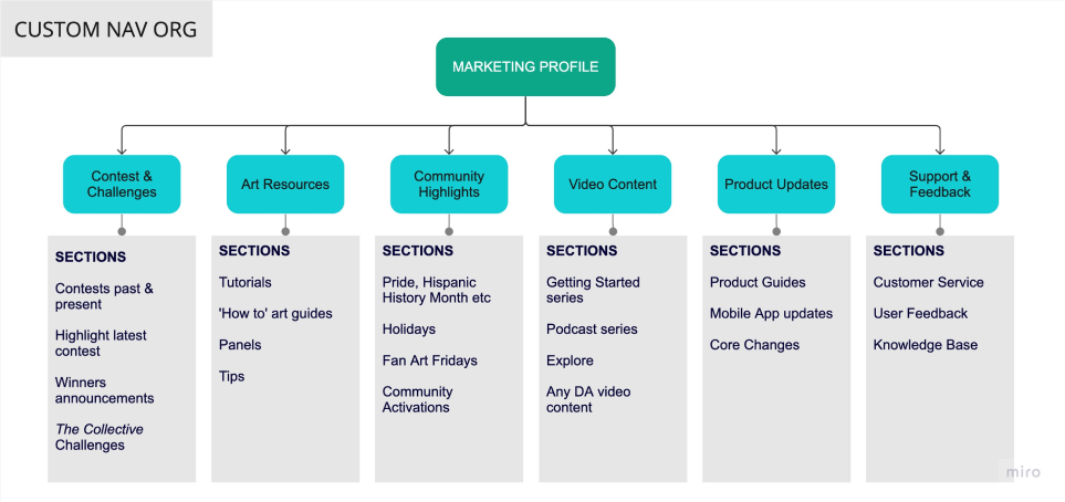
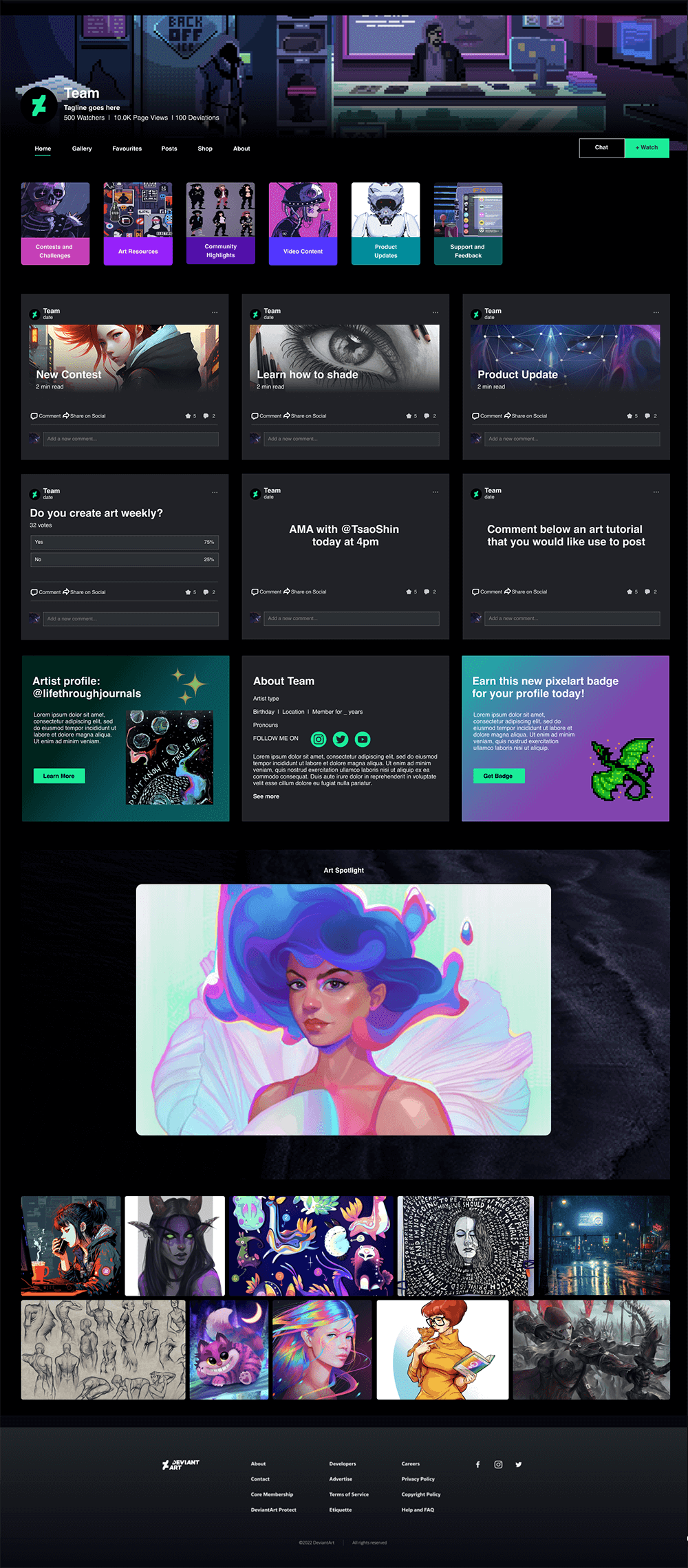
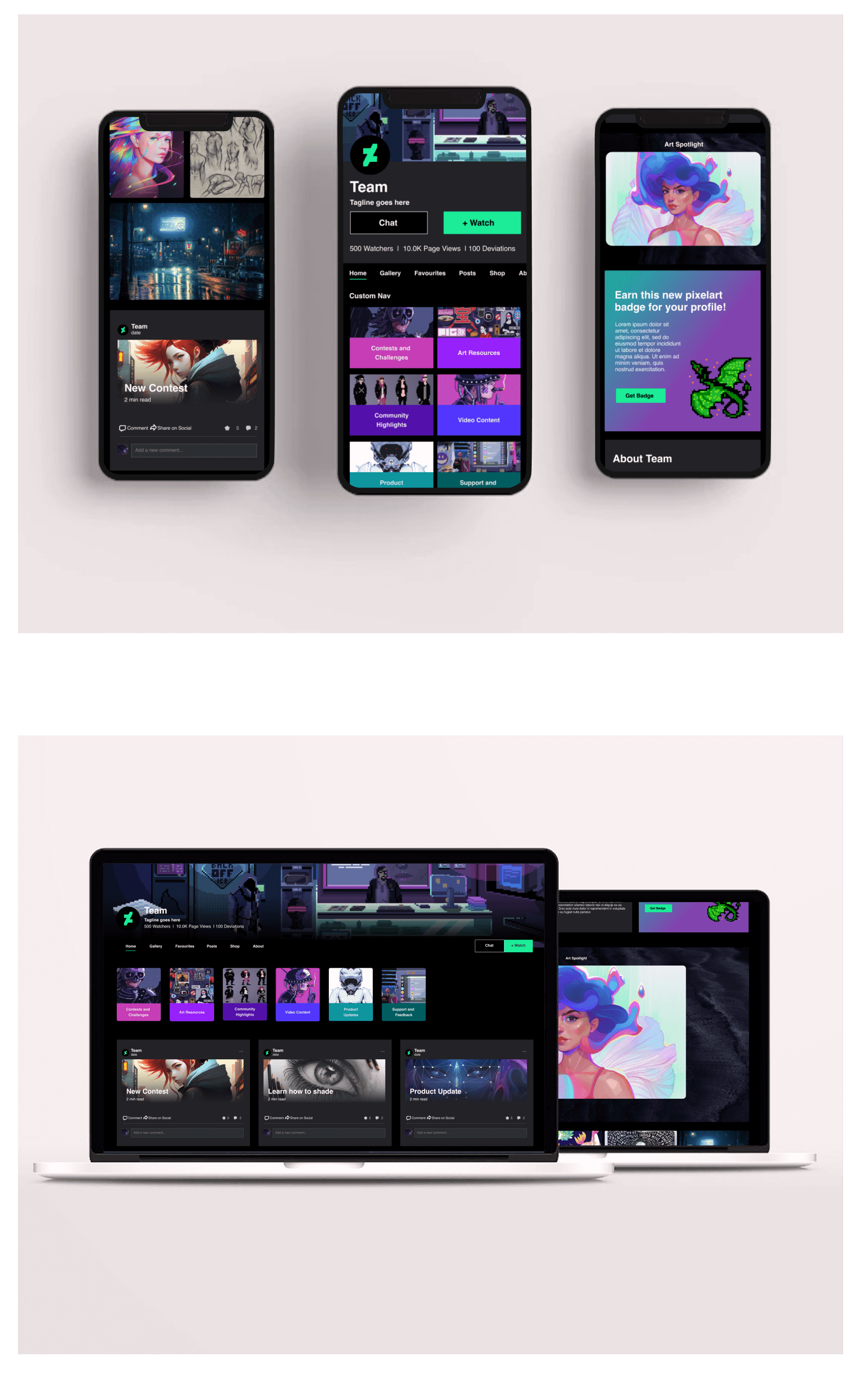
Marketing profile - color mocks
Using the new top nav I was able to organize and link to all the various types marketing content and clearly point DA users to the type of content they were looking for. The cleaner layout and content hierarchy allowed me to feature current articles and blog posts from the marketing team and also impactful artist features.
Increase views for redesigned profile
Before the redesign the views for marketing profile were very low.
0.04% of daily users visit the ‘Team’ profile
0.5% of users who visited DeviantArt saw Team / marketing content
0.1% of active users follow the ‘Team’ profile
In collaboration with marketing and the data team, I did some research and analysis of how many users were seeing the marketing content. I found that a vast majority of users weren’t seeing the DeviantArt ‘Team’ profile or the marketing content. I realized that there was a significant opportunity to increase traffic to the profile and therefore the marketing content.
Once we had the new profile design we needed to come up with solutions to promote the profile and increase views.
Ideas to boost traffic
In order to increase the traffic we made a list of suggested options that could help users find the new marketing profile page.
1 – Boost our own content using AI. Team gains priority in the algorithm or we hold space for team content in the feed that users see.
2 – Watch Team. Make all users automatically watch the Team account
3 – Add Team icon to watch bar. If auto watch is not technically possible then we can add the Team icon to the Watching top bar on each users watch page
4- Reverse deprioritizing posts. Journals (blog pages) make up a large part of our marketing content but journals have been deprioritized in organic visibility on the site. Changing that would boost Team content

5 – Path to Team profile from art pages. Deviation pages (individual art pages) are more visited than the home page. Adding a path to the Team profile from deviation pages could help boost traffic.
6 – Add Team icon to nav bar on home page. Add an icon to the nav bar on the home page that leads to the Team profile
7 – Onboarding Add ‘Follow Team’ to the onboarding sign up process. The default can be to follow Team